The Problem:
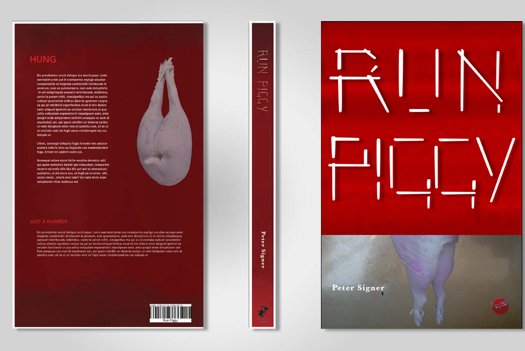
I was asked to create a typeface from my surrounding environment. After experimentation, I landed on the chopstick, as they are readily available in my household. Following confirmation from my tutor, I created ChinaChop, an elegant and decorative typeface.
The Idea:
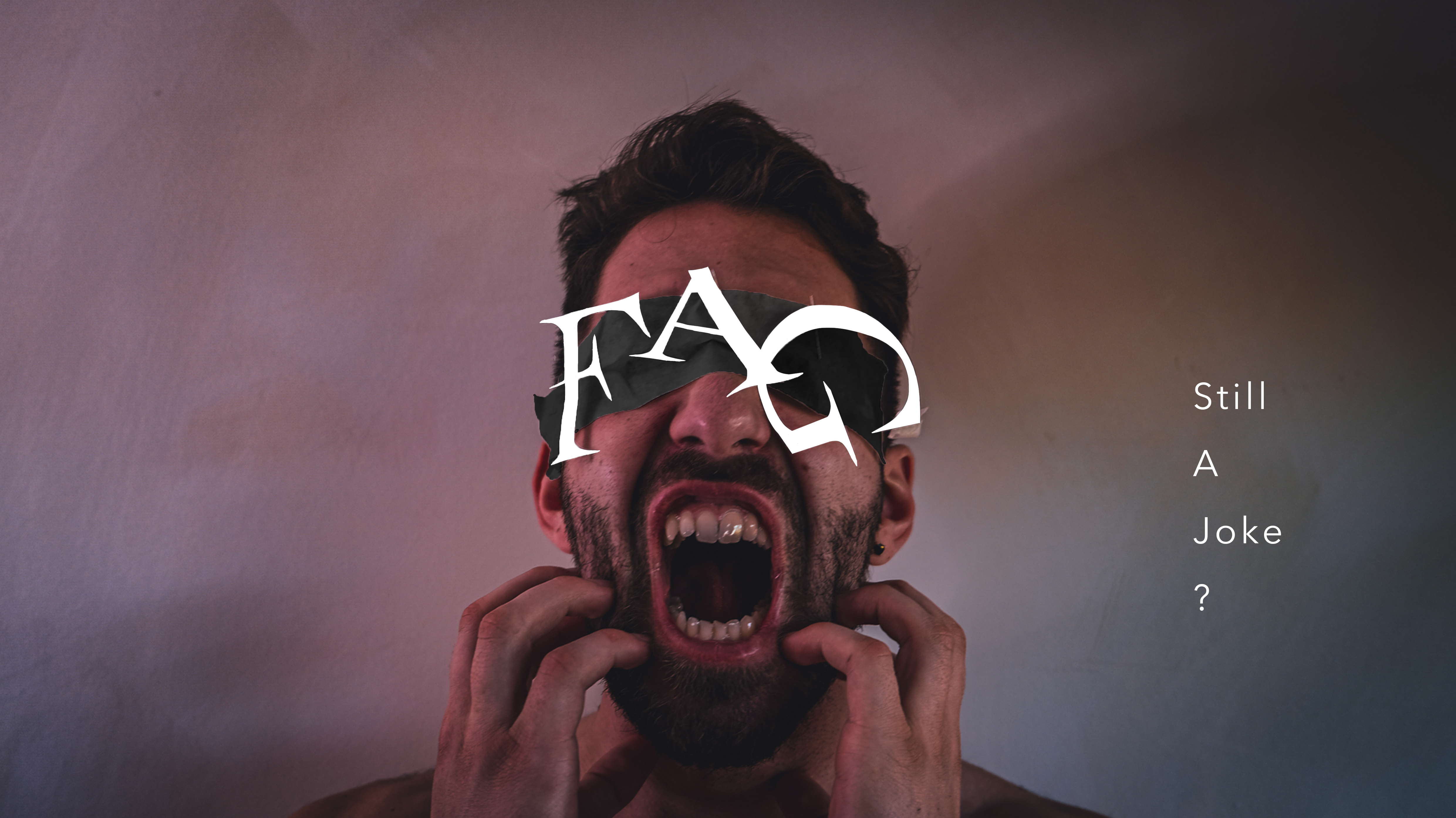
An elegant yet strict typeface. The strong structure lines and a lack of curved surfaces allow china chop to have an atmosphere of strength and vulnerability. This is created through the strong straight lines juxtaposing the thinness of the font.
The Execution:
The typeface was created in adobe illustrator, I developed an uppercase and lowercase for a variety of applications. There was a lot of experimentation with how the chopstick could bend e.g. melting a chopstick. There was a continuously iterative process, before the final result.

